Friday, May 16, 2008

War Has Never Been So Much Fun!

The final body of work proposed for my degree show was collaborated by myself and Joe Hayward. Throughout this year, we have been interested in the concept of combining war and play. Play can be through the medium of humour to the extreme of childish immaturity, or it could be through the notion of games or gaming. Using the topic of war and processing it through play and humour, we have created our latest body of work which consists of paintings, photographs, sculpture and installation.

Primarily, the installation was the bullet point of our body of work. The 8ft wooden room housed the sculptures and some of the paintings included in the selection. It is a standalone 8x8x8ft room constructed from MDF boards and painted white to add a military-style ‘uniform’ to the piece. On the floor of the installation inside we place black body casts of people that had been constructed out of modrock. They had been sprayed black to give the illusion of charred bodies, and aftermath of war. But in reality, all you were essentially looking at were casts of naked female bodies.

Surrounding these casts we places heaps of sand, so the viewer could not see the wooden floor of the installation, thus giving the perception that the viewer had entered a desert-war scene, complete with burnt bodies as casualties. But the viewer would be foolish to feel such a way, after all it is only sand, many people tie a cognitive link to the sand as a childhood memory, playing amongst the sand with a bucket and spade.

Image and video hosting by TinyPic


On the inside of the installation walls were 4 hung paintings. ‘Project: Blue Fire’, a piece earlier finished by both of us, and 3 more recent paintings.


Image and video hosting by TinyPic


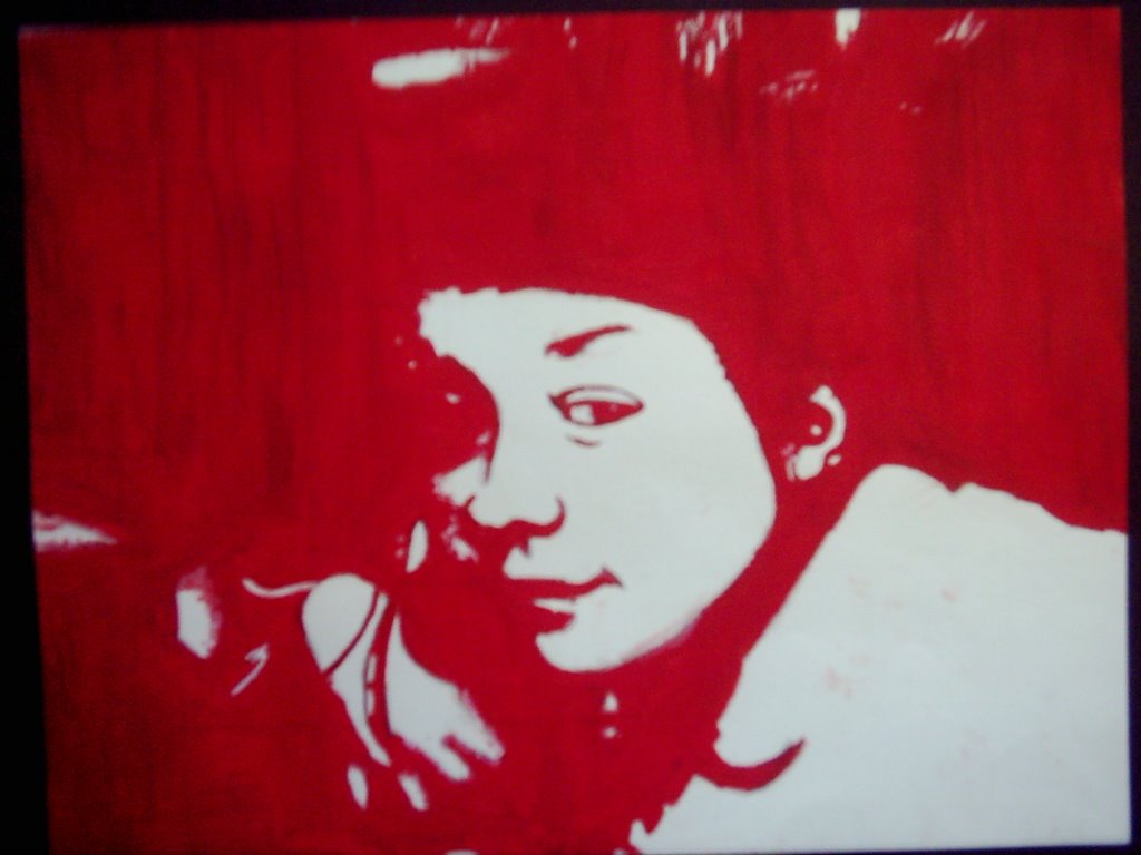
‘Crazy Enough For War’ is a painting created in more figurative way and is a staged portrait of myself mocking the stereotypical image of a modern soldier. Photographed by my collaborative partner, Joe, we both worked on this painting, taking stints on different sections of the painting and regularly going over and improving each others sections of the work.

‘New Recruit’ can be seen as a controversial painting for this subject, as it features a model child who has helped pose for this painting. It brings up the taboo of child soldiers and the way children have been brutalised as victims of war for centuries. It is more apparent in modern wars such as Iraq where toxic Depleted Uranium ammunition dropped by coalition forces have contaminated Iraq homelands, including the home grounds of such children. The pose shows the child dressed in adult soldier equipment which is way too big for him in reality, but addresses the subject of play, when many of us as children would dress up as army men. This would at the time perceive the army and war as ‘cool’ and ‘fun’. But no emotion of fun is shown on the face of the child in the painting.

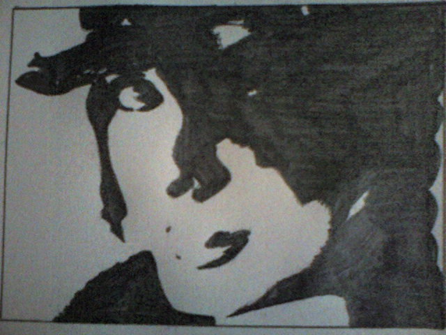
The smaller painting which is hung on the smallest of the 4 inside walls is a portrait painting of U.S. President, George W. Bush. Slight alterations to the face have been made within this painting, such as the addition of a red clowns smile, streaked across the mouth of Bush. Some people may refer to the American leader as a ‘clown’ because of the acts committed whilst in power have been deemed by some as stupid. This is reflected by the clown reference apparent on the painting.

On the outside walls of the installation would be a comedic opposite of the harsh depiction of war presented inside the installation. On the outside would be the first image the viewer would see about our work and evidently our vision of war. We have chosen a particularly comedic image of myself and Joe dressed in full adult army equipment, sat on a small duck which is supposed to be used by children at a children’s park in Leeds. We wanted the viewer to feel slightly amused by this piece, only then to enter the installation and see for himself the lesser-humorous, uncomfortable side to war. It’s as almost the viewer was told ‘your experience may differ’ when entering the hut. This is because the advertisements and media coverage of the modern way is a ghastly glorification to what actually happens on the frontlines and in the aftermath. The photograph on the outside is almost there as bait to lure the viewer into a sense of disillusionment and a false sense of state, much like the media advertisement propaganda.

On the walls adjacent to the installation would be some of our older works, ‘Stars and Stripes’, and ‘Walk With Me In Hell’.

Image and video hosting by TinyPic

We felt these two pieces shared the same qualities of war and play and should be included indirectly to the installation. We found we had space on the opposing walls to the installation so we figured this was the perfect space for the two canvases.

Thursday, May 15, 2008

Stars And Stripes

Image and video hosting by TinyPic

Stars And Stripes

This piece was created again by myself and Joe Hayward as part of a collaborative body of work for 2008. The piece has been entered into the John Moores 25 contemporary painting competition and have yet to receive notification of qualification to the shortlist phase of the competition.

The Stars and Stripes gets its name from what is on the canvas, and also the meaning behind it. The term ‘stars and stripes’ is more widely known as the nickname to the flag of the USA. But in this painting, the flag image is that of Great Britain’s, nicknamed the Union Jack. The ‘stripes’ in this piece stand for the block coloured lines created for the colour in the UK flag. They have been created by taping off sections of the canvas and running ink down the canvas until it had stained its target area. This can be viewed as how blood stains a battlefield

The ‘stars’ of the painting are the 185 names of the UK soldiers that have been killed in combat in the Iraq war from 2003 – March 2008 (time of painting). These 185 names have been lifted from the MOD website and used to decorate this patriotic art piece. I use the term ‘patriotic’ with a hint of sarcasm, as I find it sickening that the government uses the same method to glorify wars in memorials and plaques, by washing a sense of glory and pride into the families that have lost dads, brothers and sons to pointless wars in the past. In short, the same memorial style method to this painting is my own personal attack on the government.

The final layer on this painting consists of many red and blue toy soldiers which have been glued to the canvas in formation. This could be a marching formation or a burial formation. Perhaps the soldiers are marching towards their grave?


Image and video hosting by TinyPic


The rows of soldiers obscure the already distorted names of the dead, as if stripping the importance of the already dead soldiers, as they most likely will already have had their boots filled in the war and army by fresh, new recruits. As if pumped from a manufacturing line, the new soldiers foolishly take pride in marching in the footsteps of their fallen comrades, only to possibly make reservation, at the same graveyard as their ex-comrades.

Wednesday, May 14, 2008

Paranoia Is A Killer

Image and video hosting by TinyPic

Possibly my only sculpture work from 2008 that I managed to see through to the end and also find reason as to why it stands in my studio as it does.
Recently, I have been dealing with the notion of personal feelings and emotions combined with war and also the question of what it must be like to be inside a soldiers head during conflict on such a ‘real’ scale

Image and video hosting by TinyPic

Post-war reports which contain interviews with soldiers suggest that mental health can deteriorate when people have been exposed to graphical and physical war and perhaps not mentally ready for the maelstrom they have just been thrown into. In this piece, I have tried to visually recreate the feeling of ultimate paranoia on a battlefield. Not the part where you hallucinate or think people are talking about you, but the point where you are convinced you are the enemy and you begin to argue with yourself.
In the diorama, try to imagine yourself as both characters used. They are not visually the same, as so to confuse the viewer, but the scene depicts a paranoia breakdown on the battlefield, where the soldier has attacked himself, and therefore committed suicide. Visually, it doesn’t look that horrific to start with – but the added meaning can be related to real life incidents of war, which instantly makes the piece look more controversial and tainted.

Image and video hosting by TinyPic

The models in the piece are models from Warhammer 40K, a war tabletop game, as primarily myself and Joe Hayward planned to work on a series of diorama’s created with Warhammer models, but the idea was scrapped as we felt the project wasn’t generic enough, because we ourselves had not created the models, and the war figurines were world-widely known and could be recognized swiftly.

Walk With Me In Hell

(Image is painting 50% Completed)

Image and video hosting by TinyPic


Officially my tallest work to date, the burnt monstrosity entitled ‘Walk With Me In Hell’ measures 4ft x 8ft. The piece was initially painted using acrylics and a paint roller to create a large blend effect between the red and orange colours. The aim was to create an image of hell as if it was on this Earth and more importantly, in the War.


Image and video hosting by TinyPic


In war, at lot of things tend to blow up, or catch fire, so flames are no stranger to war. In reflection of this, flames are no stranger to this canvas. The darkened initial image is a threshold drawing in marker pen of the burning oil fields in Iraq, which have then been dripped upwards using hairspray to match the direction of blend between red and orange, already on the canvas.

Next step was to burn the canvas, to recreate a charred effect on the skin of the canvas, as if it had been dragged through a war zone. Many modern war artists are tied to a regiment and take pictures and document all they see. They tend to create their artwork at home after their tour or back at the barracks. In my piece, I have tried to give the impression that the painting has been created in the middle of a war, with explosions going off around the artist. A humorous but dangerous concept to say the least.

My main source of inspiration for this piece is the aptly named song ‘Walk with me in Hell’ by American artists Lamb of God. The song is powerful and paints a picture of destruction and chaos. From inspiration by listening to this song, and visualising what I wanted to create, the finished canvas will hopefully be as close to how I first imagined.

The final image burnt into the canvas signifies a human, could be your commanding officer: asking you to walk with him in hell, or go with him to war. Many soldiers have thought that the tours and patrols of Iraq have been not too far from a ‘Walk in Hell’.

Project Pixelated Combat

Image and video hosting by TinyPic


Project Pixelated Combat achieves its name from the way the image is drawn on the wall with marker pen, the smooth lines are replaced with harsh jagged edges, as if the image has become pixelated due to it being too large and therefore distorting the image.

This gave a sense of virtualness to the image as if the image was not real. The image itself consisted of two characters battling in a futuristic war-type scenario. The notion given that the pixels relate to a virtual game world again ties the two worlds of war and play, a combination found interesting by both myself and Joe, and also one we want to pursue in later works.

The image itself was created by myself and Joe in a PC game, as we were after an image which would start small and eventually look distorted and pixelated by the time it was enlarged to such a scale.

This image was created in the PC game. Warhammer 40K: Dark Crusade. A popular game for fans of the Warhammer genre, and it was one step away from what we were doing with the small models previously.

We both liked this image a lot, and it was again re-used in a similar Pixelated Combat body of work. Also, we had talked about maybe trying to create this ‘scene’ in 3D form, using the Warhammer 40K models.

Project: Blue Fire

Image and video hosting by TinyPic


Since entering my third year on my Fine Art degree course, I have picked up more methods of creating art through experimentation, one of which involving an unlikely combination of pen, ink and hairspray. The process leaves the initial drawn image distorted and denotes degradation amongst other things. I have directed my intentions to a specific topic within war, a topic which I have addressed before, the Depleted Uranium area. This subject is rarely known of, and holds a very significant amount of irony behind all the media and how the world thinks the U.S. fights in ‘war’.

I have researched this topic earlier in this file, under the Depleted Uranium (5.4 Billion Years In the Making) series and will shortly be pinpointing more events along this subject to hopefully achieve more striking effects with my work.

The only large piece of work I have created this year is ‘Project Blue Fire’, a 7ft x 6ft Canvas. The initial image of the Iraq burning oil fields with a tank in the foreground was drawn on in marker pen. This picture had been edited in Photoshop first and was purely black and white. My next step was to apply a wash of blue ink across the entire canvas, this was to make sure that no part of the canvas was to be left white, nothing in this story was pure – all of it had been tainted. We are told that it has been covered in blue ink and you choose to believe it so, even though you did not see me do it, such is the likeness of the veil of the U.S. media and how the story of the war is tainted towards their advantage before laid before the public.

What I want to highlight is still the brutality and realness of Depleted Uranium and at the same time touch on how stories can be changed and twisted to virtually ‘make up’ another story that differs dramatically from the truth – the true stories never really become public knowledge, and it has never been so evident around the topic of Depleted Uranium bullets.

Once More With Feeling

Image and video hosting by TinyPic

I had stumbled across a new technique on small-scale canvases which involved an initial layer of permanent ink, which was the image (on most occasions, a self-portrait). The second layer was a wash of slightly diluted ink, I experimented with different colours and shades, but blues and greens gave the most visually interesting results, in my opinion. The third layer was the new one to me, it involved spraying hairspray along the top side of the canvas and consequently the liquid would drip down the canvas, taking some of the permanent ink and most of the washed ink with it. This process was new to me and left exciting and a potentially brilliant result at the end of all the layers.

The background image of my latest piece was nothing short of plain, not much to behold. Although when the final layer was added, which was an outlined graphite self-portrait, the whole painting changed. The people in the background were broken up by the lines of myself, without realising it myself, until I had done it. This stands for a lot in my life, considering past and memories. It’s as if those lines of me, were me and they mapped out my influences on people and how my presence or ‘taint’ had affected people over time (the dripping of the hairspray). These are the foundations of my work, which are still only just starting to make sense, which I hope to evolve into more interesting pieces, still keeping similar meanings.

Friday, June 16, 2006

Dear Victoria...


Created to mark the departure of one of my most loved freinds, Victoria from my home town Doncaster. Uncommisioned, more of a suprise gift for her really, with threshold portraits of everyone from home. Acrylic on Canvas 50" x 40"

Sunday, May 14, 2006

"Bugatti Veyron"

"Bugatti Veyron" 2006 Oil on Canvas (183cm x 183cm)


This epic 6ft by 6ft canvas is the biggest I've done to date and is of the Bugatti supercar I saw in Berlin. This is completely original and was for the final exhibiiton on my degree course, prints are for sale on this. I blurred the background on the original photo to give more detail to the foreground and eventually make the car stand out more. Again I have worked heavily with the white oil paint to give that epic shine effect.

Ford GT

"Ford GT" 2006 Oil on Canvas
This peice is one of the later peices I did in uni as a swing back to cars in February '06. I decided to paint this from a calender because of the awesome reflections between the car and the neon lit street.

Saturday, May 13, 2006

"Portraits"

Final A-Level Peice, Oil on Canvas
"Amy" Oil on paper
"Richard" Pencil on paper

"Zoe" Pencil on paper
This selection came after my gothic work and wrapped up my A-Level for the end of 2005, all these painting/drawings were 2005 produced and were original photo's with a Photoshop effect apllied, then painted/drawn from the finished print-out. I liked these style of portraits because many people could tell who they were, and both parites appreciated then end result, bit Warhol-esque I think though.....

My Gothic Paintings

"Strigoi" 2005 Oil on Canvas
"Urien Rakarth" (not original) 2005 Oil on paper
"Decapitator" (not original) 2005 Oil on paper
"The work on John Blanhce" 2005 Oil on Paper
This section was a change to my car work and swung more towards research paintings of another artist and to see how well i could re-create them to see if the gothic style was good for me to paint as well as love. The top Strigoi Vampire inspirational draft was the most successful to date within any genre.

Halo Paintings

Halo (not original) 2005 Oil on Paper
Covenant Elite (not original) Oil on Paper
Above are two non-original pictures I found and HAD to paint to express to myself the level of detail I could produce painting metallic surfaces that isnt a car, e.g. Armour. The more I used turps and linseed oil within my paints, the smoother but more volatile the end result was.

More A-Level Car Work

A-Level Unit 4 Final Peice 2005 Oil On Canvas
Closer up photo of the bottom right section of the above canvas.
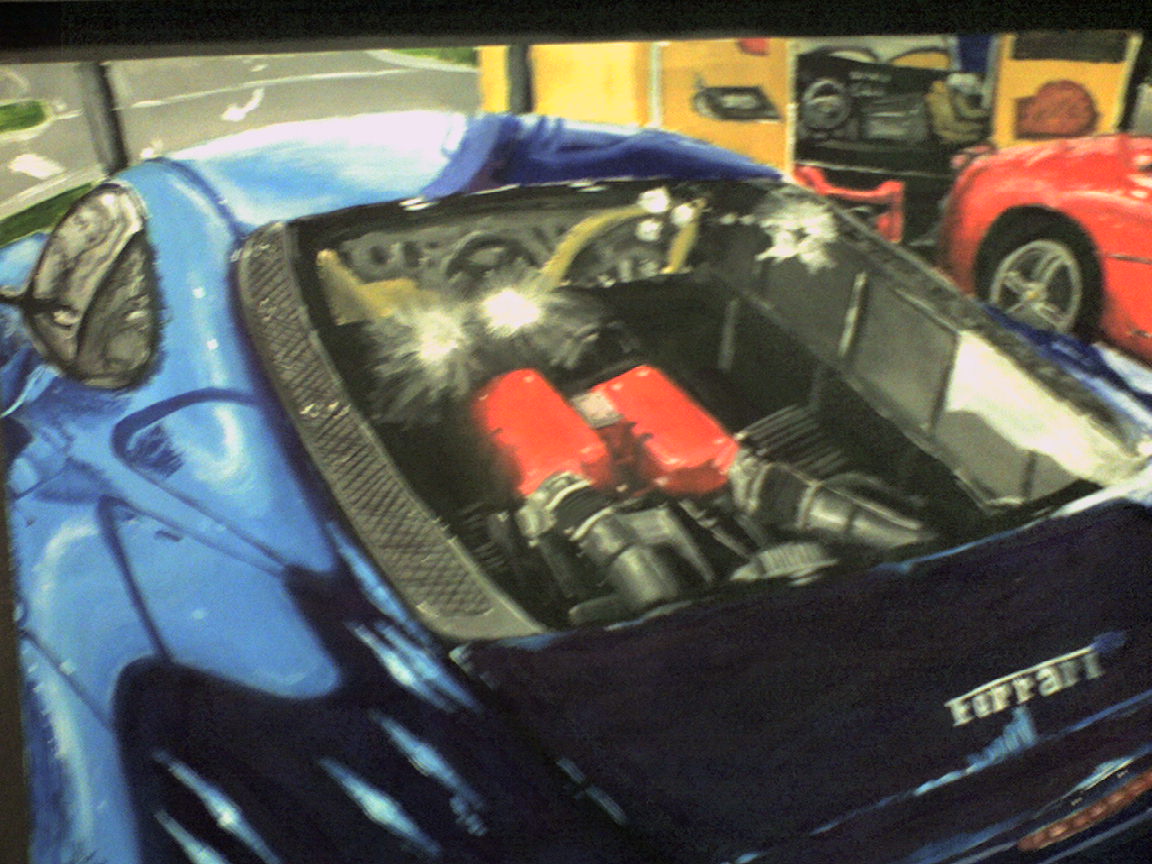
"Ferarri Enzo" 2005 Oil On Canvas "The Power of Ferrari" 2004 Oil on Paper
The above paintings are all of normal cars, when I say that I mean they are a change from the previous A-Level unit, theyre not crashed. My main focus was on the metallic surface and the shine it could give and the reaction with heavy use of white oil paint and white spirit which depicted this metallic shine.

In The Beginning...


Ill start displaying in chronological order :). This is my first unit within A-Level and the subject was based around car crashes which led to mid-air crashes applied detail to the shards. This was the end of unit final peice which depicts the collision between Ralf Schumacher (above) and Rubens Barrychello (underneath). Formula 1, Melbourne 2002. Oil on Paper (90x60cm)

Introduction

Hi, I'm Ryan and this is designed to be my main source for displaying and advertising my artwork to...well generally everyone. Im currently about to move into the second year in a Fine Art degree course at Huddersfield Univeristy. My art style has developed heavily in the past 6 years but my preferred style is photo-realsim but I am a fan of fantasy/gothic and photo-manipulative art - painted or printed. Hope you enjoy my stuff. Ryan